How to Get Your New Twitter Banner Right

Twitter announced Tuesday afternoon on its blog that the new web profile design is now available to all users. For references, here is what the new web profile looks like:
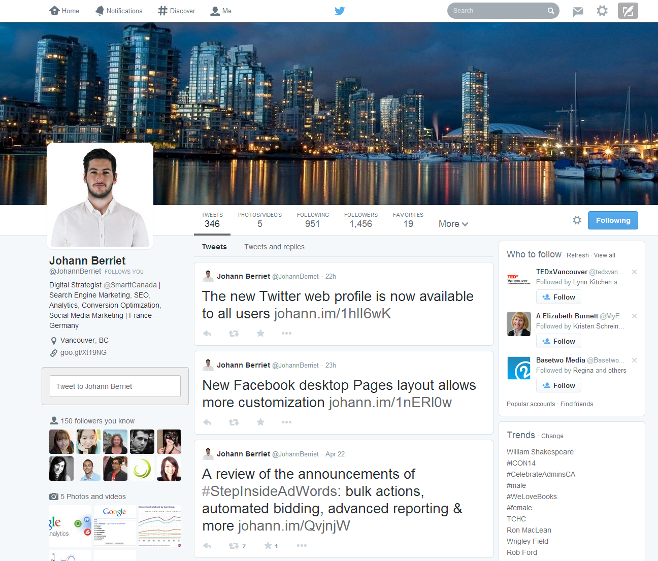
In addition to the new banner and the larger profile photos, the new web profile brings the following changes:
- Best Tweets: the Tweets receiving the most engagement are now displayed more prominently (larger font size)
- Pinned Tweets: you now have the ability to pin one of your Tweets to the top of your web profile
- Filtered Tweets: you can now filter the content seen on other people’s profile. You now have the choice between regular Tweets, Tweets with photos/videos or Tweets with replies (note that all Tweets starting with a @ are perceived by Google as replies, you might want to pay attention to that)
- Followers/Following Grid View: your following and followers sections now use a Pinterest-style grid view
To get the new web profiles, you can either:
- Login to Twitter and click on the following call-to-action:

- Click here and you will automatically be directed to the editing of your profile
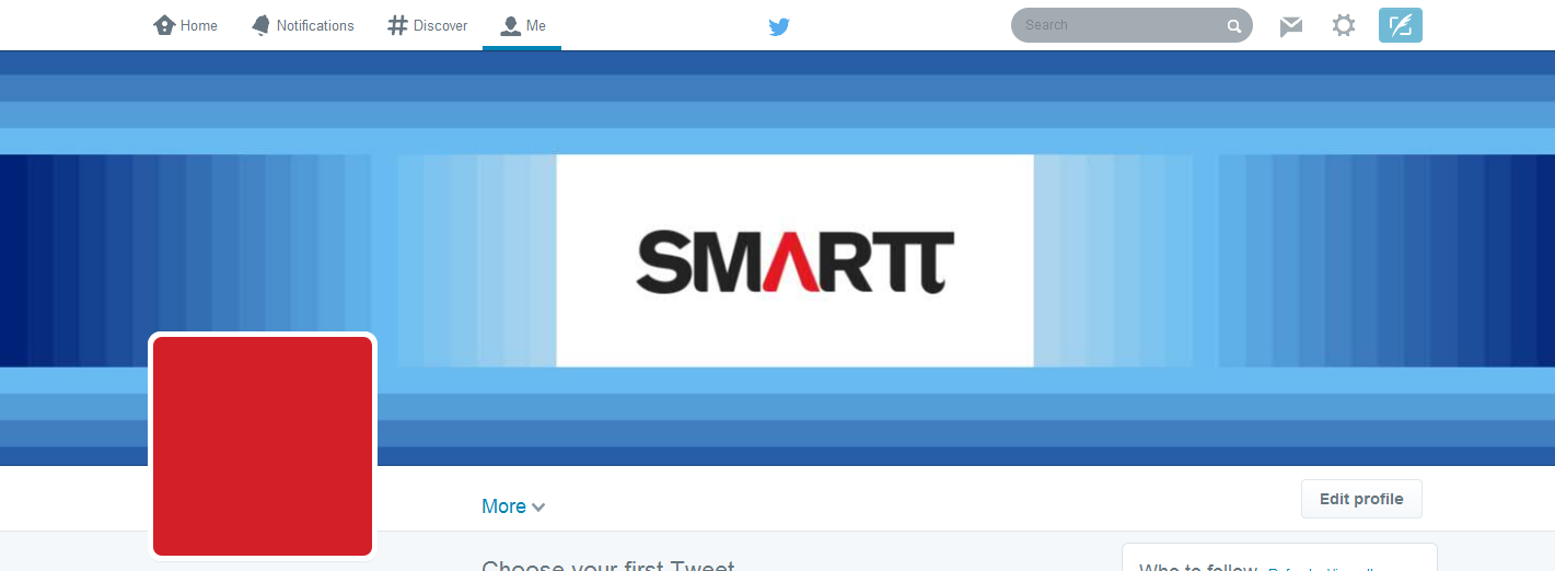
When testing the new Twitter web profile we realized that the 1500x500px banner is actually cropped quite a lot, depending on the device used to access Twitter. We decided to test the new Twitter banner on the following resolutions:
- 1920x1200px (21” desktop screen)
- 1440x900 (15” laptop screen)
- 640x1136 (iPhone 5)
Test banner:

Here is what our test banner looks like on the 3 resolutions mentioned above:
- 1920x1200px (21” desktop screen)
The banner is cropped by approximately 50px at the top and at the bottom. - 1440x900 (15” laptop screen)
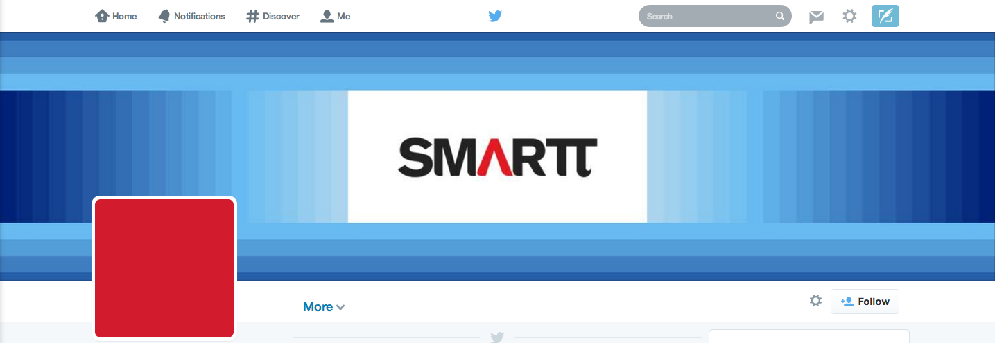
This time the banner is cropped at the top and bottom (65px). - 640x1136 (iPhone 5)
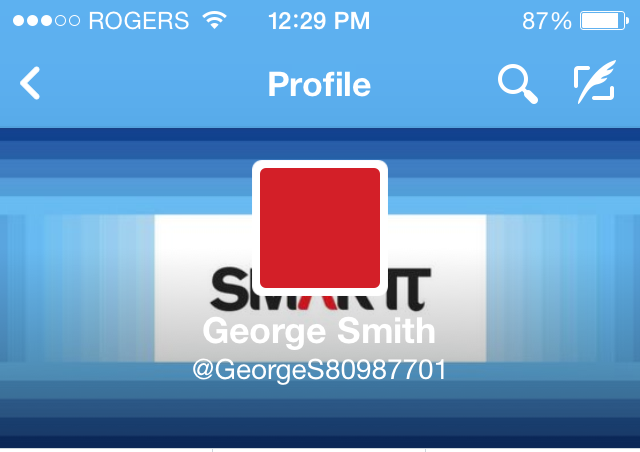
On iPhone, the banner is cropped at the top and bottom (roughly 37px), and also on each of the sides (315px) each side.
Based on this test, we realized that the banner can be cropped as much as:
- 130px vertically
- 630px horizontally
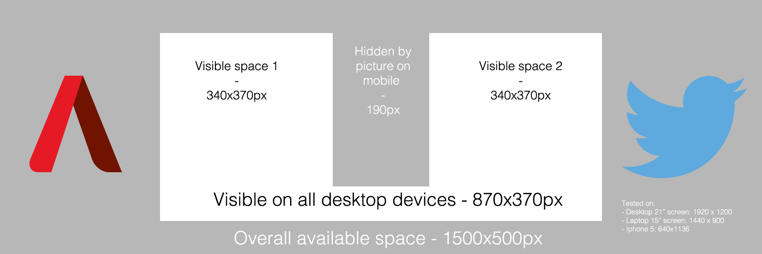
As a result, we recommend to place your most valuable content in an 870x370px area (centered in the banner) to ensure it will be displayed on all devices. It is also important to note that on mobile devices, the profile picture, name and Twitter handle are centered in the banner and hide part of it. The area hidden by the profile picture is 190px wide on the iPhone, so you might want to also avoid placing important content there.
Here is a quick summary of our findings:
Get in touch with us if you would like to discuss how Smartt can help you optimize your social media marketing strategy, either through our contact page or Twitter.
